Statistics is the language of patterns, predictions, and perspective. t’s behind everything from understanding your exam results to spotting patterns in public health or predicting next month’s business performance. Far from being just numbers on a page, statistics offers a way to find clarity in complexity — to measure, compare, and draw meaningful conclusions from the information around us. In today’s data-driven world, this kind of thinking isn’t just useful — it’s essential.
Seeing the Big Picture Through Numbers
Statistics isn’t about memorizing formulas — it’s about making sense of the world around us. Think about this:
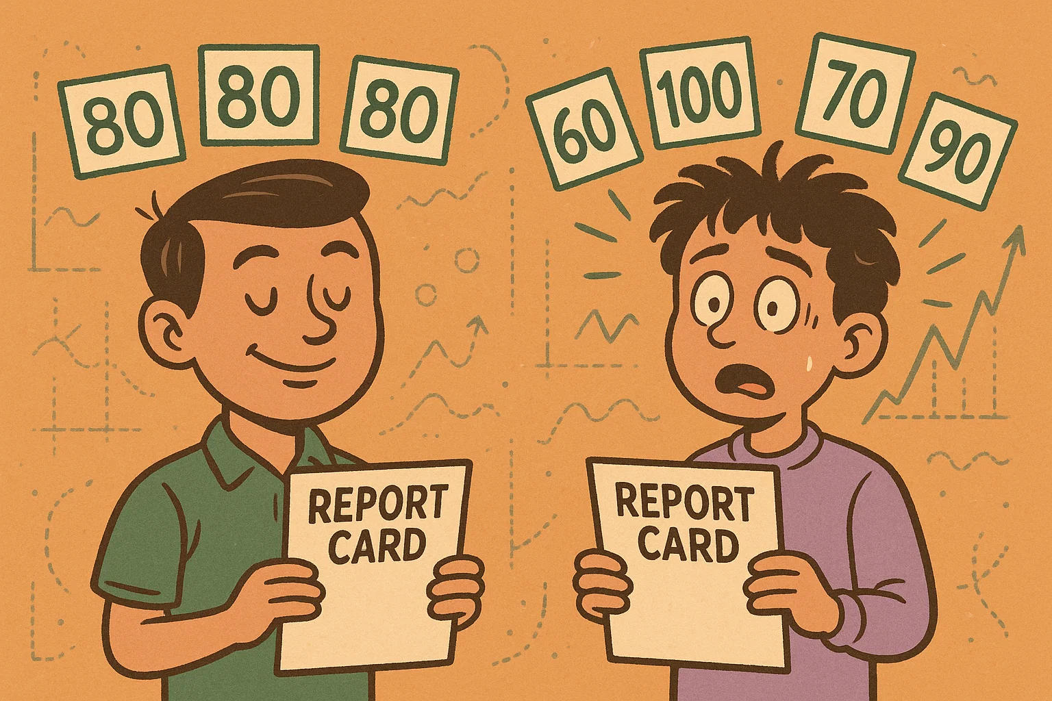
“If two students both average 80 on their math tests, does that mean they performed the same?”
At first glance, yes. But let’s say one student consistently scores around 80 every time, while the other jumps between 60 and 100. Same average — completely different story. That’s where statistical thinking helps. It uncovers the patterns hiding beneath the numbers.
When we want to summarize a bunch of data into something more digestible, we often rely on measures of center — tools that help us find the middle ground in different ways:
-
Mean (average): Best when your data is evenly balanced.
-
Median: Useful when a few extreme values might distort the average — like when looking at income or house prices.
-
Mode: Perfect for finding the most common item in a set, such as the most popular product size or survey response.
Each one highlights a different aspect of your data. Choosing the right one depends on what question you're trying to answer.
If you’re ever unsure or just want to explore your own dataset, a tool like the mean calculator can give you a quick, clear summary. It’s simple, fast, and helps bring structure to what might otherwise just feel like a pile of numbers.
Patterns, Spread, and What They Tell Us
Let’s say two people track their sleep for a week. Both end up averaging 7 hours a night. Seems similar, right?
But here’s the twist:
-
Person A sleeps between 6.8 and 7.2 hours each night — pretty steady.
-
Person B ranges from 4 hours one night to 10 the next — a total rollercoaster.
Now you’re starting to see it: averages don’t always capture the full picture.
This is where spread comes in. It’s about how much the values in a dataset move around — and it can completely change how we interpret results.
Here are a few ways we understand that “movement”:
-
Range gives you the span from lowest to highest.
-
Standard deviation digs deeper. It shows how much the numbers cluster around the average.
-
Outliers are the wild cards — unusually high or low values that can throw things off.
Same average, different rhythms. Which one would you rather live with?
If you’re trying to compare consistency — whether it’s in sleep, test scores, or delivery times — tools like a standard deviation calculator can help you break it down. It takes your data and shows you whether the results are steady or scattered.
Because the real insight often isn’t in the middle — it’s in the movement around it.
Correlation, Causation, and the Stories Data Tells
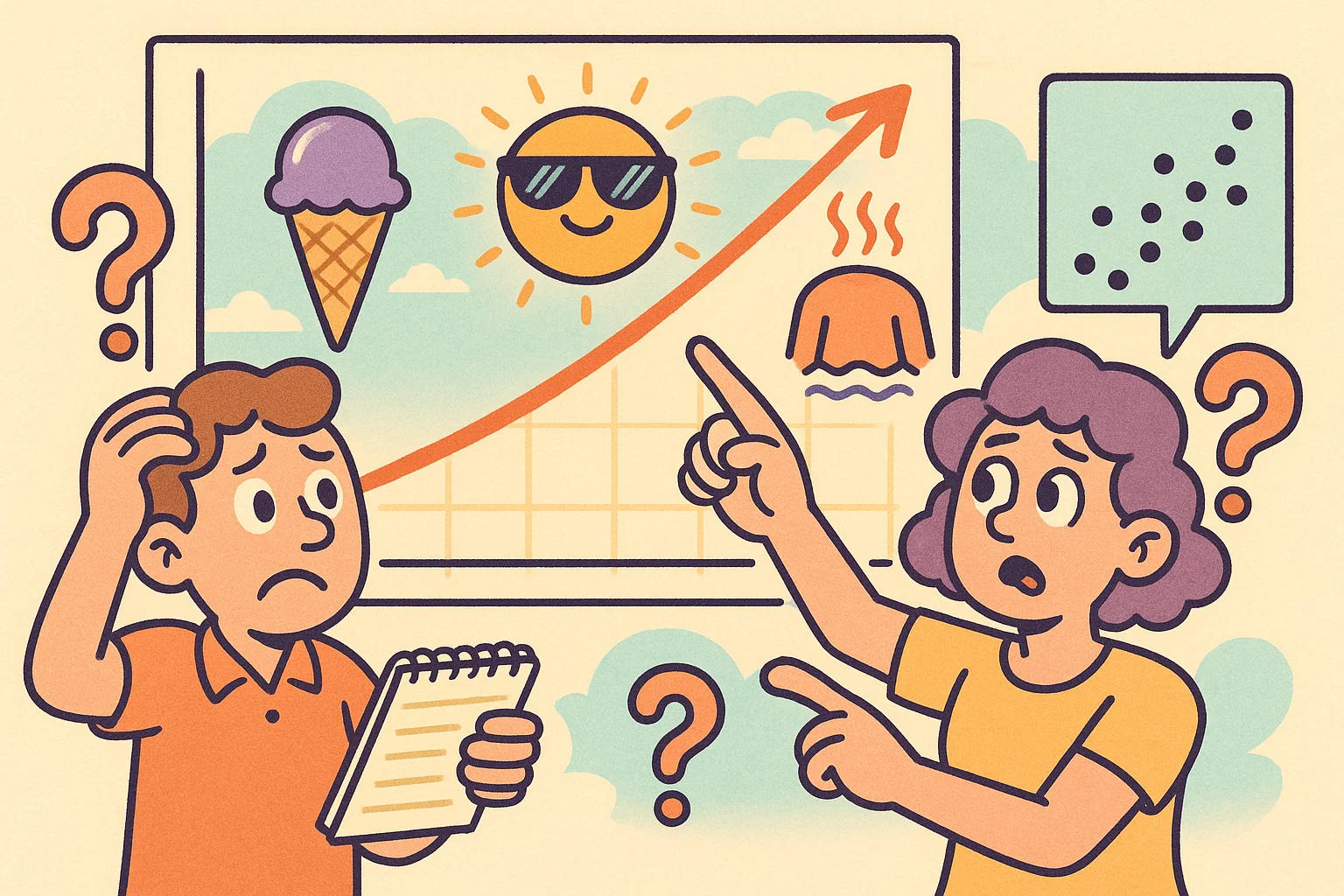
Have you ever noticed that on hot days, both ice cream sales and sunburn cases seem to spike?
It might look like eating more ice cream causes more sunburns — but you probably already know that’s not true. What’s really happening is a classic case of correlation without causation. The real factor? Summer. People go outside more, which leads to both sunburns and ice cream cravings.
This is one of the first things statistics teaches us: just because two things move together doesn’t mean one causes the other.
Correlation simply tells us there’s a relationship — a pattern — between two variables. It doesn’t explain why. That’s where people often jump to the wrong conclusions.
“If two things are connected, how do I know if one causes the other — or if something else is at play?”
That’s a smart question. One way we start answering it is by looking at scatter plots, which visualize how two sets of data relate. Are the dots close together in a straight line? That usually means a strong correlation. If they’re scattered everywhere, the connection’s probably weak or nonexistent.
Want to explore this with your own data? Try our correlation coefficient calculator to get a clearer picture of the relationships you're curious about. Sometimes, the story behind the numbers is more surprising than it looks.
Learning Statistics Is Like Learning to See
Statistics can seem intimidating at first — full of formulas and technical terms. But once you start to learn it, it’s like putting on a new pair of glasses. Suddenly, things come into focus. You begin to see patterns in your spending, school performance, or even how trends rise and fall around you.
“It’s not about doing harder math — it’s about seeing the story behind the numbers.”
You don’t need to be a data expert to benefit from statistical thinking. With the right mindset and simple tools to help, anyone can start asking better questions and making more informed decisions.
Whether you're studying for school, running a business, or just curious about the world, statistics gives you a clearer way to understand it. The insights are already there — statistics just helps you notice them.