Table of content
From designers to students and researchers, anyone who deals with words visually will eventually encounter the need for better text presentation. Typography converters, also known as text formatting tools or online font converters, are helping bridge the gap between basic fonts and beautifully structured, readable content. But what exactly is typography? How does a converter assist in enhancing legibility, tone, and communication? This guide walks you through typography’s evolution, real-world applications, and the mechanics behind conversion tools, using insights from academic research, government archives, and real examples that go far beyond the basic "change font" function.
What is Typography?
At its core, typography is the art and technique of arranging type to make written language not only readable, but meaningful and emotionally resonant. It’s more than just choosing a pretty font — it’s creating a visual structure that supports communication. Whether you’re reading a road sign, a novel, or a website, typography silently shapes how you understand and feel about what you see.
At its core, typography is how letters and words are displayed through font, size, spacing, alignment, and hierarchy. Typography’s primary function is to increase readability and guide the eye, but it also plays a deeper role in establishing tone and brand identity. A scientific paper typeset in Comic Sans would feel strange, even untrustworthy. Why? Because typefaces have personality, and we intuitively recognize it.
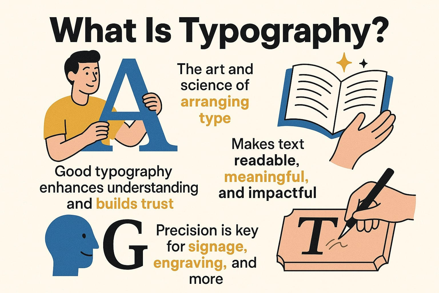
According to a report on web usability published by the U.S. Department of Health and Human Services, typography significantly affects how users perceive and trust content1. A 2020 study from the University of Reading found that small differences in typography can impact reading speed and comprehension, especially for people with dyslexia or other reading difficulties. Turns out, typography isn’t just about aesthetics — it also directly affects cognitive load.
Typography Converter vs. Generator vs. Font Converter:
-
Typography converter: Transforms text into different typographic styles (like bold, italic, serif) using Unicode or CSS.
-
Typography generator: Creates decorative or creative text for visual content.
-
Font converter: Converts font file types (e.g., TTF to OTF) for compatibility across platforms.
Each tool serves a different need, from casual formatting to professional design.
How It Works
Most typography converters rely on Unicode, replacing standard characters with visually styled equivalents. On the web, they may also generate CSS to apply custom fonts or styles. Some focus on web-safe fonts, ensuring compatibility across devices.
Real-World Uses: Students & researchers use it to format papers, citations, or presentations. Designers & brands use it to create a consistent visual identity. Developers & creators apply it for better readability and UX on websites or digital products.
In short, typography converters bridge style and function, making text not just readable, but expressive.
How to use the Typography Converter
Typography Converters are often easier than you think. Most tools are designed to be user-friendly, even if you have no design or coding knowledge. Whether you're formatting text for a presentation or formatting a quote for social media, here's how to get started:
Step 1: Open Typography Converter
Go to a website or platform that offers Typography Converter.
Step 2: Type or Paste Your Text
Type your message directly into the input box or paste the text you want to convert.
Step 3: Choose an Output Style or Format
Choose the typeface you want — it can be bold, italic, serif, sans serif, cursive, or even monospaced.
Note: If your goal is compatibility (e.g., exporting to Word, PDF, or Google Docs), choose a simple, readable style.
Step 4: Copy the Converted Text
Once your text is converted, simply click “Copy” or select and copy the output manually.
Step 5: Paste and Use Anywhere
You can now paste the formatted text
The typography converter makes it easy to add polish and structure to any text — no design degree required.
Smart Picks
With so many typography tools out there, choosing the right one can be overwhelming, especially if you’re not a designer. But don’t worry, whether you’re a student formatting a report or a content creator formatting your brand, the best tool is the one that meets your needs without making things too complicated.
What to Look for in a Good Typography Converter:
-
Ease of Use: You don’t need a tutorial to learn. A clear interface and simple steps are key.
-
Preview Feature: Seeing how your text will look before copying it can save you a lot of time.
-
A Variety of Styles: A good tool offers a variety of typography styles — from clean and professional to creative and bold.
-
Cross-Platform Compatibility: Whether you’re working on Word, Google Docs, or a website, the converted text should paste and display correctly.
-
Unicode Support: This ensures the tool uses standardized characters that display correctly across devices and browsers.
Free vs. Paid Tools: What’s the Difference?
Here is a quick comparison:
|
Feature |
Open-Source Tool |
Premium Typography Platform |
|
Cost |
Free |
Subscription-based or one-time fee |
|
Customization |
Moderate |
High |
|
Support |
Community-driven |
Professional, responsive |
|
Best for |
Students, hobbyists, developers |
Designers, agencies, and content creators |
The right typography tool isn’t necessarily the prettiest one — it’s the one that works best for your particular project. Think about how you plan to use it, and let clarity and consistency guide you.
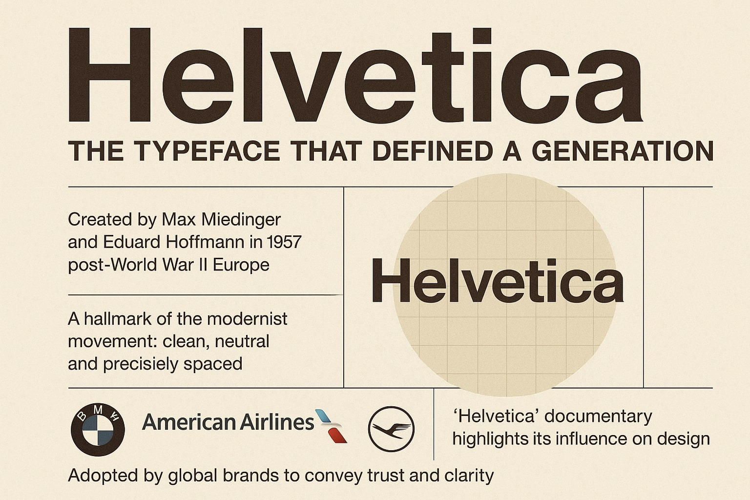
The Man Who Hated Helvetica
Meet Erik Spiekermann — German typographer, designer, and the unapologetic man who once declared Helvetica “a disease.” That’s right. While most people think of Helvetica as the vanilla ice cream of type — neutral, clean, safe — Spiekermann saw it as boring, overused, and lacking soul.
But this wasn’t just personal taste. To him, Helvetica symbolized the flattening of visual personality. “It’s like air. Everyone uses it, but no one thinks about it,” he once said in an interview. He refused to use it in any of his major design projects — opting instead for typefaces with character, tension, and what he called “humanity.”
And Erik didn’t just complain. He created. Spiekermann co-designed FF Meta, a typeface dubbed “the Helvetica of the ’90s” — though ironically, it was everything Helvetica wasn’t. Where Helvetica was stiff and neutral, Meta was warm, slightly curved, and dynamic. It became a favorite in public-sector design, especially for signage and transportation systems across Europe.
In a world where fonts were becoming increasingly invisible, Erik stood up and said: Type matters — and personality matters more.
Fun fact: In 2007, when Helvetica the documentary came out (yes, there’s a whole film about the font), Erik was featured as one of the strongest critics — his interview clips went viral in the design world, not because he was rude, but because he was right: not every message deserves the same voice.
His story is a reminder that behind every typeface is a voice — and sometimes, a rebel who refuses to settle for default.
Check out Conversion section for automatic conversion, fast and easy